


June 30, 2025
There has been so much going on since our last update, which we'd like to share with you from insights, inspiring articles and what we’ve been up to.
⏲️ 1-Minute Insight
We Hit a Brand Tug-of-war...
🎥 Behind the Scenes
How to have too much fun on a shoot with Granite 5
'Paint me like one of your curly office companions.’ by Jordan
Jazz's Big Adventure
🎨 Featured Project
Curwen Print Study Centre
🎞️ A Cut Above the Rest
Liberty Place Case Study
🎙️Memory Lanes Podcast
Lexie Carducci - Renovation Hurdles & Planning Committee Showdowns
🧠 An Interesting Read
Soft-centred Pastries & Their Impact
💡 What’s Inspiring Us
Home cook to Chef-grade with Belazu - A Repositioning by Wonderhood Studios
📚A Book Recommendation
'A Creative Masterclass' One+One=Three by David Trott

Author - Matthew Garrett

As part of an animation project, we hit an odd design tug-of-war: practicality pulling one way, visual identity pulling the other.
On one side… yellow, the near-universal colour of caution. It’s loud, alerting, and instantly linked with safety, especially around chemicals.
On the other side… A brand palette made of blue and yellow. Not quite incompatible, until you realise yellow and blue together carry some very strong, very Swedish associations.
Now, I’m not usually phased by overlaps in brand colours, but the blue-and-yellow combo is thoroughly dominated by IKEA that it’s tough to use without evoking flatpacks and meatballs. That’s not a vibe our client, focused on serious safety-led training, was aiming for.
So we’re stuck. Lean into the yellow for clarity and function, or avoid it to dodge brand confusion. Either way, we solve one problem but nudge the other back to the surface.
This is where aesthetic becomes function, and function becomes aesthetic.
We didn’t ditch yellow, but we did shift the blues to be darker, used more muted tones that gave yellow room to lead without shouting IKEA. The hierarchy of colour did the heavy lifting. Same palette, different outcome.
The moral of this microtale: It’s the small considerations, built on experience, which really make the difference. It’s knowing when you’re presented with two options, neither of which solves the problem, you’ve got to find the sneaky third option. That’s problem-solving sometimes.
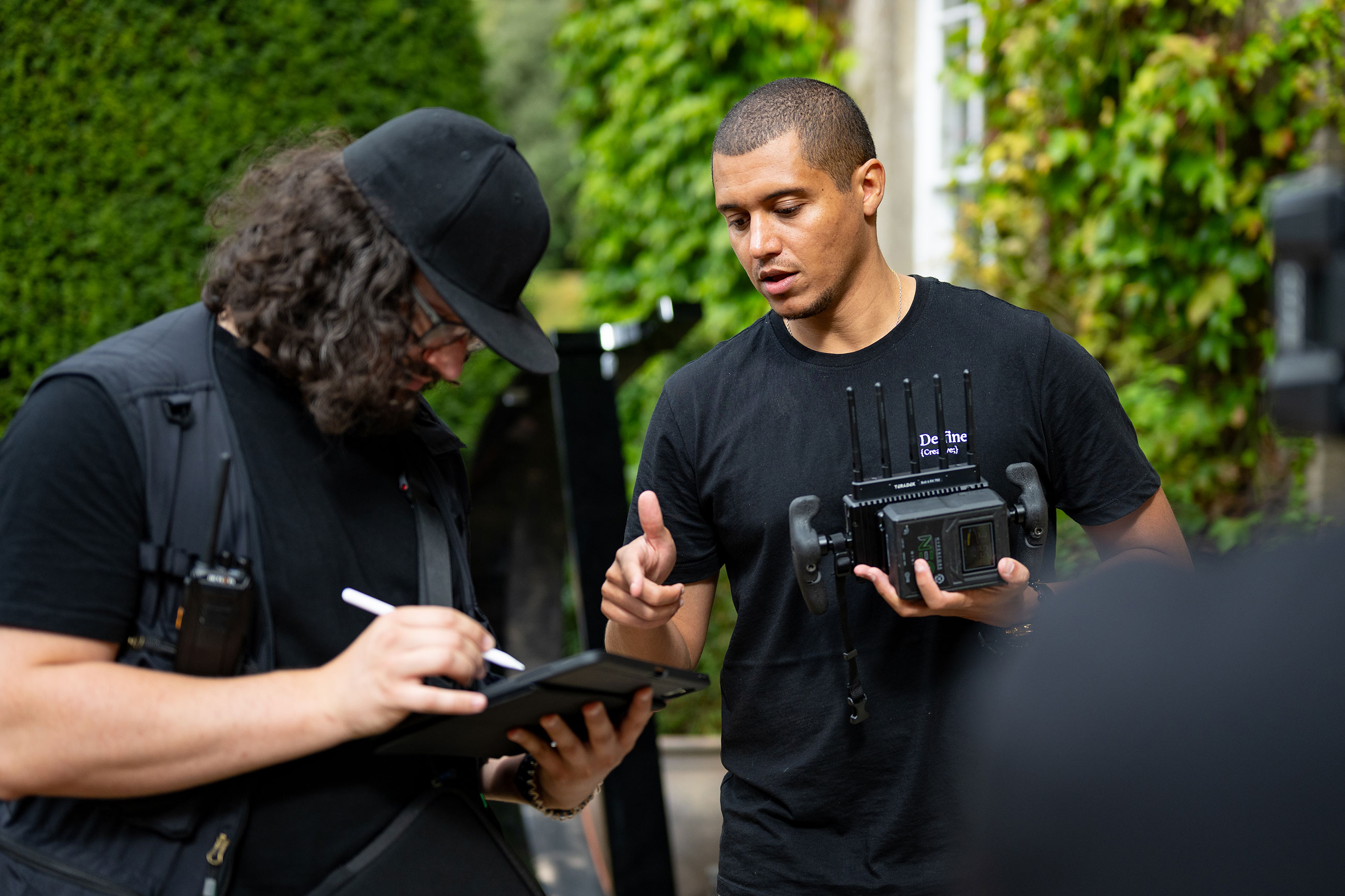
Sometimes we capture a little more than we planned, and this shoot was no exception.✨
The chemistry between Simon, Sue, Rachael and our team was something special.
While many of these moments didn’t make it into the final cut, we couldn’t let them go unseen.So here’s a little peek behind the curtain, a glimpse at just how relaxed and fun these shoots can be.
After all the talk, and excitement of working with Curwen Print Study Centre, Jordan was inspired to take pen to paper, capturing his most fabulous friend in the throes of a motion project. Quite the likeness if you ask me.

Cat yoga is the best way to unwind in the afternoon.

🧑🎨 A place where creativity, community, and calm come together.
Tucked away in a peaceful rural setting, Curwen Print Study Centre is a place to discover art as well as a space for reflection, growth, and creative connection.
It’s a studio steeped in legacy, alive with the energy of makers, and open to anyone ready to explore their artistic expression.
Curwen wanted to share what makes the space so special – to connect with more people, both professional artists to those picking up a print roller for the very first time. The warmth of the community, the hands-on craft, and the quiet joy of creating something from scratch.
Together, we created a series of films that bring this atmosphere to life. Through calm, observational footage, sensory detail, and the voices of those who know the space best — students, tutors, and staff. We aimed to give viewers a real sense of what it feels like to be there. From schools discovering printmaking for the first time to adults returning to a creative practice, each story adds a layer to Curwen’s unique character.
This project has been a joy to shape, and we’re proud to help shine a light on a place that continues to inspire so many.
See the full video and case study on the Curen project here.
To learn more about Curwen Print Study Centre and how to get involved, visit their site: https://www.curwenprintstudy.co.uk/
A selection of our favourite shots featured In a homeowner case study at -Liberty Place, for Bovis via The Oracle Group.
Lexie Carducci has bought a property every year for the last 10 years, but it hasn’t always gone to plan…
From a showdown with 57 objectors to finding an actual unexploded bomb, she shares the wild highs and tough lessons from a decade in property.
It’s honest, funny, emotional, and full of surprises! 🤭
Watch the full episode here:
Youtube
Spotify
A Summary by Jazz Paramasivan

It was a hot English Summer’s day in London: muggy, sweaty, humid and hot. Paired with walking up and down the stairs from the Spice Girls’ Wannabe video, you have the wonderful event we had the pleasure of capturing for Dotmatics.
After a hectic start to the day, setting up our gear and getting everything in the right place to start filming, we were welcomed into the dining area, or what I would have called a doorway into heaven.
The tables were covered in golden swirls and crescent-shaped goods that you could smell from the corridor. We had a break where we took our plates and ventured over, and I couldn’t believe how meticulously everything had been laid out. It was like those breakfasts they have in American TV shows where the teenage protagonist grabs a strawberry and walks out the door, leaving behind a whole buffet.
I plated up a classic pain au chocolat for myself and the team and some fruit and headed back to our base, which was in one of the conference rooms. I distributed the goods and we huddled behind the cameras. I took a bite, not expecting what was to come next.
To my surprise, it was like nothing else I’d had before. Expecting rough flakes to hit my mouth and get stuck to the back of my teeth like supermarket pastries, I was instead greeted with a warm and soft feeling. It was the best pastry I’d ever had the pleasure of eating in the UK (nothing can compare to those of our European neighbours).
Of course, I had to go back for another, but this time I decided to push the boat out and go for a cinnamon swirl. And boy, it did swirl up some emotions. Another great pastry with the softest centre I’d ever experienced.
A couple of hours went by, and I couldn’t stop thinking about the pastries.
“Jazz, have you got those memory cards?”
Jordan jolted me back to reality.
Memory cards…the only memories I could think of were those of the pastries. I had to get more. So I did what any normal person would, and asked the staff if they had any left (which I knew they did as I’d seen the leftovers get carted away. I felt like a dog owner being separated from their pet.)
“I’m afraid not. Sorry about that”.
My heart shattered. But I guess the moral of the story is: it is better to have loved and lost than not to have loved at all.
Author - Jasmine Paramasivan

I recently came across this campaign by Wonderhood Studios for Belazu and thought it was a brilliant example of showing how their “restaurant-quality products” can be used at home.
I loved the authentic use of notebook scribbles and photos, just like when you’re trying to experiment with new recipes at home. Both the OOH and online campaigns have received positive reviews - and I can see why!
This has sparked lots of inspiration for how we can tell our clients’ stories in a way that connects to their audiences in a heartfelt and natural way.
See their case study here: https://wonderhoodstudios.com/projects/advertising/belazu
Author - Matthew Garrett

I'd highly recommend this book for those who find reading tricky or don't have the time to read, as each anecdote goes from setup to payoff in 1-3 pages.
Essentially, it's 9 different creative concepts explained through short anecdotes on how changing your thinking can make you more creative.
If you want to see more and haven't signed up to our email list, here's where you can get notified on our next update Sign-up Here

Take a look at a selection of projects we've been working on recently here at the De·fine Creative Studio.
Have a look at our case studies from this month.
Catch-up, coffee and a biscuit? Or five. 🍪 What's not to like!?
Fill out the form below, email us at info@define-creative.co.uk or call us on: 01223 903040

info@define-creative.co.uk
01223 903040


